Secret Location

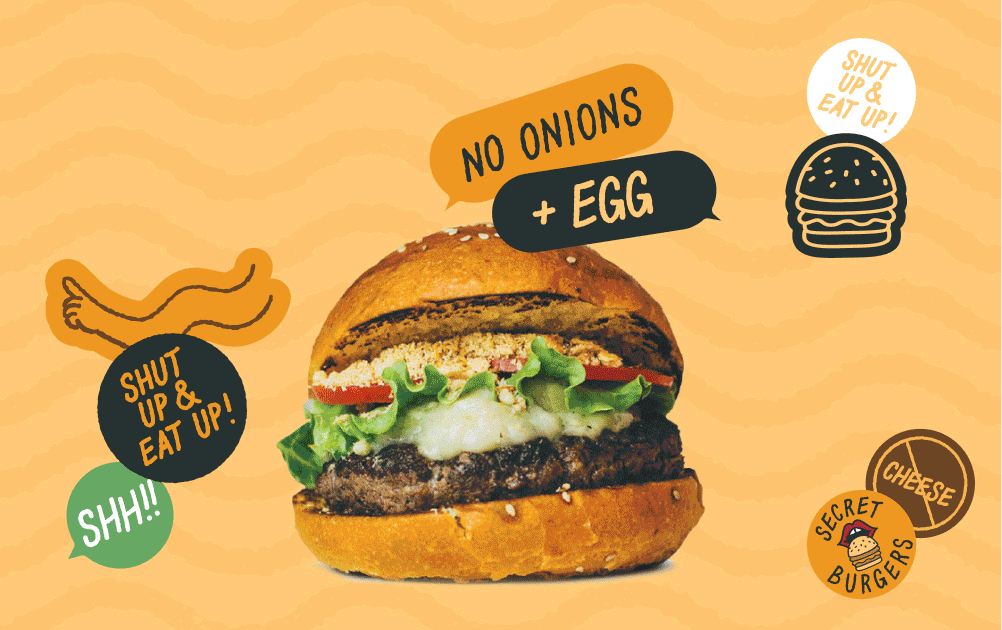
Developing a cohesive and energetic brand identity for a ghost kitchen meal delivery operation during the pandemic.

Year

2021

Service

Brand Identity Design

Project Details ↘
CHALLENGE
Cute, Colorful, Cheeky
Secret Location was introduced to me as a ghost kitchen and meal delivery operation. Secret Location was the umbrella branding for their menu offerings, which would be split into Secret Burgers, Secret Chicken, Secret Vegan, Secret Smoothies, and Secret Desserts. These sub-brands of Secret Location would have to be visually distinct from each other while being part of the same Brand system.
APPROACH
Branding by Hand
As always, I began to collect visual references and inspiration as a springboard for direction. Afterwards, the first thing I did was use my digital tablet and began sketching any ideas that came to mind. I landed on the motif of a shushing finger, a playful and cheeky nod to the behind-the-scenes operations of a ghost kitchen.
BRIEF ITEM EYEBROW
Project Header
From the sketches, I extrapolated the hand-written type and created a custom typeface for the brand. During our discovery meeting and visual research phase, I had pitched the idea of using stickers as a key component to the brand identity. The stickers could be used to distinguish the sub-brands, denote substitutions, and elevate simple affordable packaging in a pinch.
BRIEF ITEM EYEBROW
Project Header
After creating an immense library of stickers and graphics, the simple changes in color story could be used to differentiate between the Secret Location sub-brands.
← Go Back
Play
Play
Play
Play
Play
Play
Play
Play
Play
Play
Play
Play
Play
Play
Play
Play

CONNECT

Let’s get in touch! Let’s make some great design together.